
Covers Abundant. Covers Galore.
In this fast-paced day and age, waiting even a day to post something as hot as the new Harry Potter covers means you're behind the times. "Go to bed, old man!," scream the masses. And so it goes.
Now every time a new Harry Potter is due out I make sure to buy a British edition because I much prefer their covers and (sorry, Cheryl) Britishisms. Well, this year it's not the clear cut choice it used to be. America's covers have gotten classier with every passing year while Britain has gotten...
I think goofier might be the only accurate word to use. Yes. Goofier. Let's play a little compare and contrast, shall we?
America's Cover:
 I'm fairly certain that I'm the only person who likes this. I love the new color palette with its creams and browns. I like the look of Harry, and check out the wraparound:
 Nice. Of course, there is the fact that Harry and Voldemort look as if they're doing Yoga. There is that. Especially with that lovely sunrise in the background. Then again, it would be hilarious if Voldemort saw the errors of his ways all thanks to the power of the Astavakrasana position.
Britain's Cover:
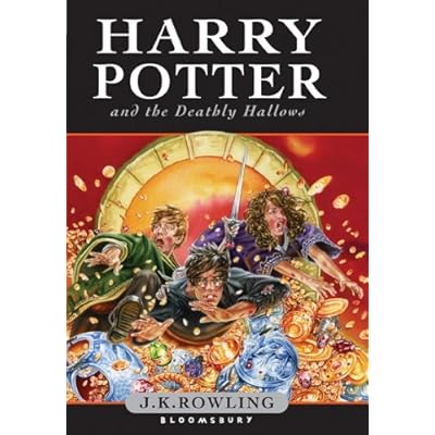 I got one word for you: Madcap. This looks like National Lampoon: Harry Potter Vacation. I can't tell if these kids are getting thrown out of the big golden circle into (what I'm fairly certain must be) Harry's Uncle Scrooge-like inheritance or if they're being sucked OUT of the money pile. Plus our hero has apparently been aged to approximately 37. Most odd. Even weirder is when you look on the back and get this:
Said one of my co-workers when he saw this, "Is that the Fortress of Solitude?" Yes! That's the twist none of us were seeing. Rowling has secretly paired with DC Comics and the result is a Harry Potter/Superman crossover spectacular! And finally:
Britain's ADULT Cover:
 Unlike the adult Half-Blood Prince cover, this puppy doesn't give anything away. We've already seen this locket before (once in flashback and once in person, if I don't miss my guess). Just lovely. And if you squint really really hard you can make out the description of the story for this last volume. It doesn't say anything you don't already know, though.
Labels: Covers, Harry Potter, Mary GrandPre: 1 Jason Cockcroft: 4
posted by fusenumber8 @ 12:28 AM
17 Comments
![]()
![]()


17 Comments:
Did you happen to notice the uncanny resemblance of the American cover to the cover of "The Higher Power of Lucky"? I posted them together on my blog.
I love the new cover though - I agree on the colors and I love Harry's facial expression.
:)
e
http://dulemba.com
Ha! Good observation. And, for that matter, more than a touch true.
Hi there,
I found this on CNN and then discovered you had beaten me to it, so I linked to your post if that is ok.
Cheers
I like the American HP cover, too. *solidarity*
You're not the only one who prefers our US cover to the British one, Fuse -- I think we're beating them solidly in the comments over on the Leaky Cauldron. But I'm astounded that you've preferred the British covers of the past to ours . . .
I'll join the others saying you are not the only person who likes the cover. I think the colors are gorgeous! I'm particularly intruiged by the parrallel body language of Voldemort and Harry.
The American covers have gotten better. It seems that after Goblet of Fire GrandPre' got the okay (the suggestion?) not to have everyone smiley smiley all the time, and in bright bright colors, no matter how dark the goings on in the book. Now it's that little lightning stroke in the type that's starting to bug me.
I love the new cover! Gah, I'm so excited!
I dig the American cover as well.
The British cover just makes me think of Scrooge McDuck's vault.
I'm seeing a definite old-Discworld urve.
Well, Cheryl, it wasn't that I loved the British covers so much as I didn't have much choice but to enjoy them more than the American. I think Brian hit the nail on the head with the problems with the early images. Something about the thick lines and cartoonish images really turned me off. I'm a thin-line gal. Always have been.
By the way, I take back my Yoga comment. The commentator on Alison Morris's new blog had it right when they said he was serving a tennis ball. That is EXACTLY what he is doing. My bad.
The British cover is hideous! When did Harry sprout those big rabbit teeth (wasn't that a Hermione thing before she figured out how to shrink her excessively large teeth?) Is Ron about to stomp on Harry's hand? And are Harry and Hermione body surfing? I'll take the yoga/tennis cover anyday over madcap romp with flying coinage...
I love the new US cover--the colors are beautiful. Hadn't observed the yoga/tennis/(tai-chi?) action before, but now it makes me chuckle.
British adult version=tasteful and somewhat elegant
British kids version=truly Aweful (as in I am in awe of how awful it really is)
Completely immature thoughts on the Lucky/Potter cover art convergence:
Harry Potter and the Deathly Scrotum
Harry Potter and the Order of the Scrotum
Harry Potter and the Scrotum of Azkaban
Okay, that's probably enough...
"Tightywhiteyconstrictivus!" shouted the Dark Lord.
I think the paperback Brit cover is a rip of some of the Philip Pullman covers.
Agree that the American cover is pretty, it also seems to imply a happier ending (fingers crossed).
The Brit hardcover is beautiful too.
Post a Comment
Subscribe to Post Comments [Atom]
<< Home