
Les Belles Timbre-Postes
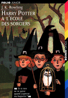
As I mentioned some time last week, I collect worldwide Harry Potter books. I like the covers, you see. Multiple artist interpretations (I'll show you the Dutch zombie cover this coming Sunday) make for a interesting reading experience. And I've always suspected that based on their covers alone, the French don't much care for HP.
Example A:
Example B:

Need I say more?
Credit where credit's due then. America wears its heart on its sleeve for Harry, but have we put him on our postage stamps yet? Not to the best of my knowledge. Know who has? The French. Guess I owe you guys an apology. Still, would it kill you to spice up your covers a little? Please? Pretty please?
Labels: Covers, French: 1 Bird: 0, Harry Potter, Stamps
posted by fusenumber8 @ 12:25 AM
5 Comments
![]()
![]()

5 Comments:
Oh my, those are hideous.
The stamps are pretty bad. But what's your problem with the French Harry Potter covers?! There's a charm and a wit about them, a touch of gentle spookiness where appropriate, and a nice palette, too. And have you taken a good look at Scholastic's strangely saccharine Goblet of Fire cover lately?
Viva la France!
Nah. I never liked the Scholastic covers either (sorry, Cheryl). For me it's German or nothing. Any nation that has the guts to put Harry in dreads and teeny tiny glasses has my instant and abiding love.
The French covers are fine for what they are, but flat. The palette is, yes, nice, but not very original. For all of them it looks as if the artist glanced at other covers from other nations and then slapped together something with only the vaguest sense of the book.
I love me my French, but surely they've a better illustrator out there. Do some Sempe Harry Potter covers! THOSE I would buy.
Not an original palette? Who worries about how original a palette is? Anyway, I went straight to Amazon to check out this German business. Well... I must respectfully disagree. The small glasses may be cool glasses but that's part of why they're not the best choice for the character. And Harry's so angular on those covers, and his lips are so pouty, and his hair is so artfully disheveled; he makes one think of a girl who got to college and realized that she could freak out her parents by cropping her hair and switching to a Women's Studies major.
Well, we still have the Scholastic covers to dislike together. Sempe's an interesting alternate idea. What I'd like to see, actually, is for Scholastic to comission HP drawings by a range of illustrators. (Macaulay's Hogwarts, Quentin Blake's Snape, etc., etc.) Then they'd have a coffee table book that they could to raise money for x, y, or z worthy cause.
Remember that you heard it hear first.
I think that this cover would appeal to a 6 year old - to me it does not really reflect the target audience it is aimed at.
I know that we should not judge a book by its cover, but let me tell you kids DO! I have problems with my kids being put off by book covers when we look at reading material in the library. Only later in life do we learn the lesson.
http://lifelongreader.blogspot.com
Post a Comment
Subscribe to Post Comments [Atom]
<< Home