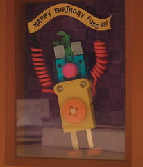
Cover Band
Y'all know my current overwhelming obsession with the covers of children's books. They're good. They're bad. They're ugly. Well, recently the Penguin Blog (I should make up t-shirts that read Smart Publishers Blog) had a piece up on creating covers for books. Admittedly they've had a good cover year so far. Changeling and Oh Rats both looked mighty fine.


5 Comments:
I did a project in library school with young adult covers. It was a blast to see the difference between the hardback covers and paperback covers. More often than not, the paperback covers were designed to look like the teen romances one might pick up in the mall.
Fuse, you should do a list of your Top 10 Favorite Covers...and maybe a Top 10 Least Favorite list.
- Jay
I once saw a bodice ripper of a cover done of "The Turn of the Screw" sold in my college bookstore. It won the award for Most Misleading Cover Ever.
And don't worry, Jay. I'm compiling all the covers I've seen for a Best of/Worst of posting that will appear at the end of the year.
The book cover discussion comes from the UK office of Penguin. Like breakfast food, soft drinks, football, and the use of the word "table" as a verb, book covers are an area of major disagreement between the US and UK. Not that the process isn't much the same here, but the results for British book publishers are, to put it mildly, all too often mind-bogglingly ugly. But that's just my American publishing sensibility.
This, I think, is true. Don't agree? Compare the early Harry Potter covers Britain to their American equivalents. Ditto anything by Nick Hornby.
Post a Comment
Subscribe to Post Comments [Atom]
<< Home